
The Coolor App is an expert app designedspecifically for Art Therapy. With this app, patients & Art Therapists will be able to connect within seconds with one another through the use of chatting, booked video sessions & meeting events near them. We hope to plan a design that is intuitive enough for both Art Therapists & their clients. In addition, the app will allow users to pose a question to any expert, & if they feel they are the best to answer it, they can schedule a short video session with the person asking.
With the prevalence of counselling services everywhere, most people still refuse to talk to a therapist based on a variety of reasons such as the lack of time, no insurance coverage or the fear of being judged. This eventually leads to a rise in mental illness cases.
How might we design a mobile and web application that could encourage our users to try out Art Therapy while gaining their trust during the whole process?
An Art Therapy app that allows individuals to have access to a built-in community of trained and certified Art Therapists as well as friendly meet up events in one’s area.
By completing a competitive analysis of a competitor, justanswer.de , I was able to better understand what users might begin to expect of an app or service like the one I was trying to build.
The analysis included an overview of the business, a marketing profile, and SWOT analysis. Each of these areas would help drive further discussion with stakeholders on how to best position an app for competition in this area.

I also identified elements of both effective and ineffective UX in the competition that might allow me to leverage off of successful designs and refrain from ineffective ones.I analysed across the following 6 domains:
Usability:
-Bottom navigation is easy to navigate.
-Expert profile page shows relevant info - picture, title, description,
& number of ratings.
Layout:
-minimal and clean layout & use of white space is visually appealing.
-categories section are nicely situated at the “ask a question
page” all the way at the top.
-good spacing between elementsmaking it visually appealing on
the eyes.
Nav Structure:
-Easy to navigate bottom navigation with only 3 options.
Compatibility:
-Works well across major browsers: Chrome, safari, firefox.
-Responsive layout.
Differentiation:
-Clear call to action on every page.
Calls to Action:
-User has to sign in or create an account before being able to connect to an expert.
“Our users need an alternative means of expression that is both efficient & cost effective that could help them express themselves and result in the treatment of their mental illness (non-psychotic: depression, anxiety, phobias…) We will know this to be true based on the number of users that use our app and how often they access our app’s services.”

How might we design a mobile and web application that could encourage our users to try out Art Therapy while feeling safe during the whole process?
This app is for everyone but is best utilizedwith anyone within the range of our target group that is currently suffering from non-psychotic mental illnesses such as: depression, anxiety, phobias etc.
I set the following research goals to serve as a foundation to guide the rest of my design. I surveyed 5 people and conducted three in-depth interviews based on the following goals:
“My first time with the counselor was not that helpful. I feel like the biggest challenges was trying to make them understand & empathize with my problem.”
"I would have wanted to have someone to talk to & who could understand me in deeper sense .”
“They might be laughing inside about my problems or they probably won’t really understand me. I’m scared that they might talk to other people about my problems.”
“Because you do not know the person and you do not want to open up to a stranger. For some people it might also be difficult to either understand or admit they need help.”
Through conducting an online survey, I was able to get both quantitative data as well as identify my user’s goals & pain points. The data generated was then used as the basis for my interview questions. Through this, I was able to determine which direction to take at the early stages of the app development.
After analyzing carefully 2 hours of interview material and survey questions, I conducted three rounds of Affinity Mapping to see what patterns would emerge. This led to a list of helpful insights that covered topics such as behaviours/attitudes, needs & goals, frustrations, quotes/facts for the app.

Insights:
To get things started, I included a few things I made sure I included any information that pertaining to my user group and that helped me empathize with them as users. Some of the few things I’ve included are the following:


Through Optimal sort, a more user-friendly site map of my user‘s preferences have been created. With thisinformation, we can definitely guarantee that the Coolor app‘s design will be intuitive and easy enough for our user personas to follow. As indicated with our successful results,(majority being above the median percentile), we can be confident that our design, will be user friendly and intuitive enough for our future users.

Wireframing helped me turn my abstract ideas into something tangible. Through this I was able to quickly iterate, clarify & refine the features of my interface.

The goal of this study is to assess the learnability for new users as they interact with the Coolor Expert application for the first time on mobile. I would like to assess how easy it is for users to complete certain tasks for the first time such as booking a meeting with their Art Therapist, searching for an Art Therapist & lastly joining a Meetup event as they encounter the interface.
The objective of the test was to see how easily users can complete the task, how many repetitions does it take for them to become efficient with that task, and lastly how much time on average does the user spend completing each task.
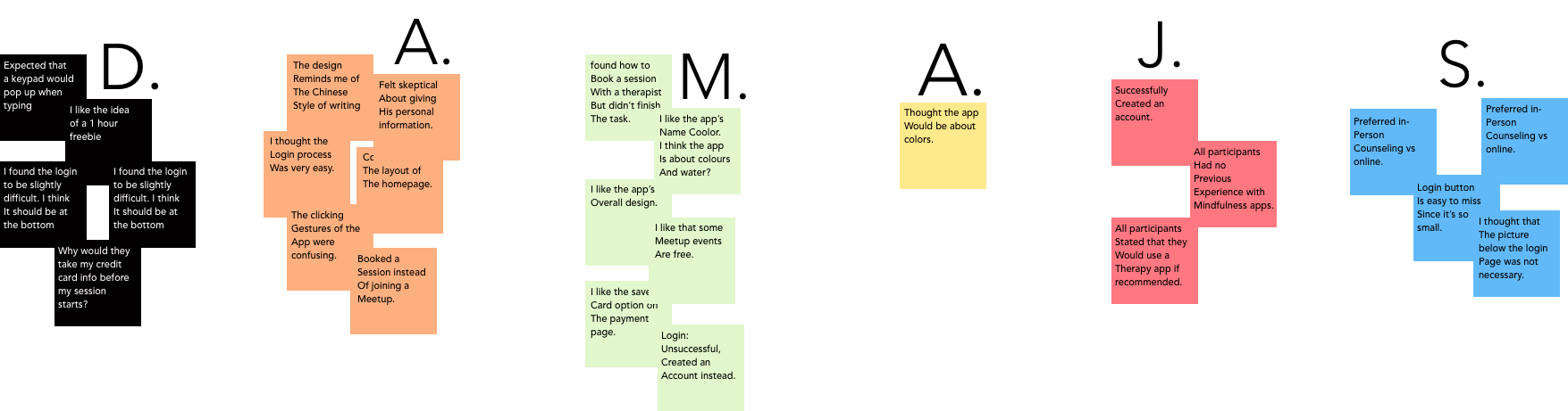
I reused my affinity mapping tool to further isolate information to identify if there were any patterns or hierarchies that would emerge. Since I will be refining an existing design, I chose to Conduct a Closed-Card- Sort approach and use set top-level categories: (Observations, Positive Quotes, Negative Quotes & Errors) to help sort out my observations.

I then proceeded to assign each participant a color and filled in the appropriate box for each observation. With this I was able to visualize the frequency of errors due to the number of colored blocks and classify their severity according to Jakob Nielsen’s four-step rating scale.
 Spreadsheet
The Coolor Prototype will definitely be subject to future iterations. I would like to prioritize features that are highly focused on the core objectives. This can be done through refining the design by analyzing which features are used the most and putting the effort into making those features both intuitive and pleasurable for the users. Finally, Tablet and Desktop designs are something to look forward to in the future.

If you like what you see and want to work together, get in touch!
hello@tracyux.com